How to Use GluVue
Getting Started
Start by selecting the GluVue link or icon in your patient's EHR chart to open the custom viewer for glucose data. This tool can be used for patients using CGM at home or in the hospital, but is also useful for anyone who has glucose related issues and relevant data in the EHR.
Filtering the Data
The target blood glucose range is set from 70 mg/DL to 180 mg/DL and nighttime hours are from 10:00 p.m.to 6:00 a.m. (22:00 to 06:00).
Time Range
At the top left of your screen, determine the timeframe you would like to see data of. The recommended timeframe is at least 14 days (2 weeks) prior to the end date.
If you want to see data from further back, there are two ways to do so:
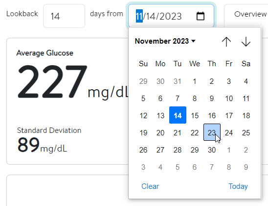
- Click the calendar icon and use the arrows to scroll to the desired date.
- Click the calendar icon and then click the dropdown menu next to the month and year. Select the desired year and month.
Days of the Week
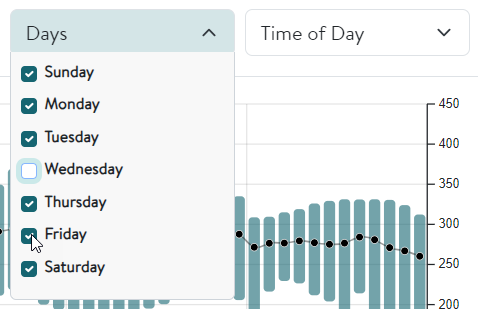
By default, data from every day of the week is included and interpreted. To exclude the data from specific days, click the dropdown menu next to Days (found in the Overview, Daily Trend, and Weekly Overlay tabs) and deselect the day(s) of the week. This will cause subsequent changes to both the visual and statistical data. Please note that any change made in one tab is replicated in the other two.
Time of Day
By default, data from both daytime and nighttime is included and interpreted. To exclude the data from one of the two options, click the dropdown menu next to Time of Day (found in the Overview, Daily Trend, and Weekly Overlay tabs) and deselect an option. This will cause subsequent changes to both the visual and statistical data. Please note that any change made in one tab is replicated in the other two.
File to Note
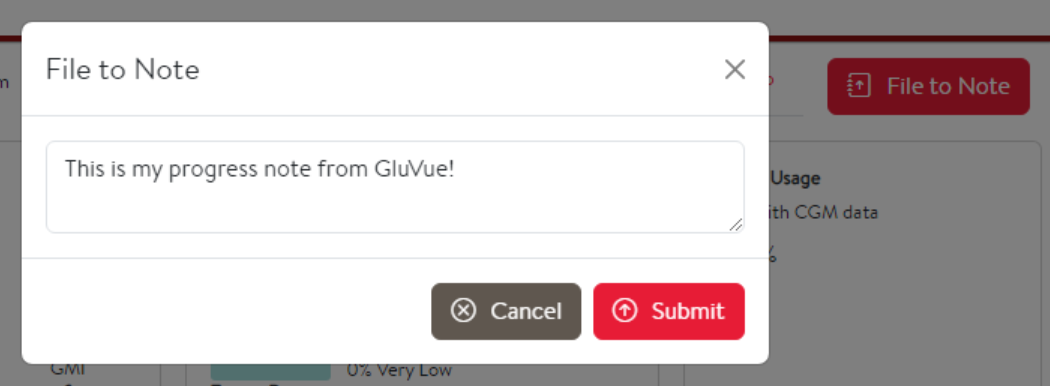
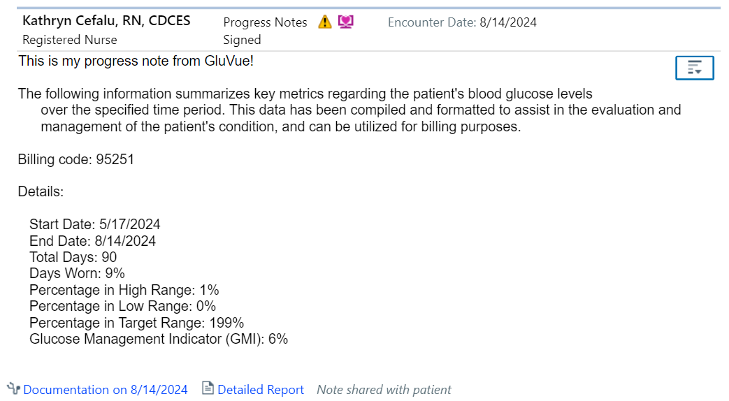
The File to Note button summarizes key statistical data points that assist in the management of the patient's blood glucose and files them to a preliminary progress note for billing purposes. This summary includes percentages for the total data collected from the chosen timeframe, time spent in high/low/target glucose ranges, and the GMI. Additionally, you have the option to include a comment with the summarized data.
To successfully file the note, the provider should open GluVue from within a Pre-charting encounter and then select the File to Note button from there. Please note that the button is limited to encounters scheduled for the next seven days.
You can also successfully file the note by creating a Documentation encounter and opening GluVue there.
Overview
The Overview tab includes a glucose as a function of date plot to see an overall trend of the patient's glucose levels for the given date range. The Overview tab is useful to quickly assess which dates may have no data available, affecting how you would interpret the visualized trends.
The Overview tab also contains a Glucose Management Indicator (GMI) which can be used to represent a patient’s A1c. This value is calculated using the average glucose levels present in the dataset.
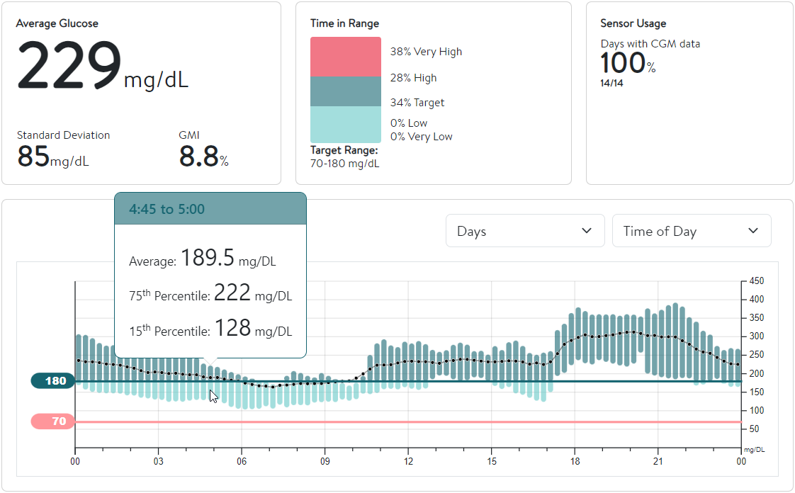
By hovering over the graph, you can see data values for a given time.
Daily Trend
The Daily Trend tab shows you glucose levels as a function of time throughout a 24-hour period. Distinct colors are used to represent the duration of time when blood glucose levels are very high (dark red), high (dark blue), target (light blue), and low/very low (light red). By hovering over the graph, you can see data values for a certain time of the day.

Weekly Overlay

The Weekly Overlay tab shows a graph with all available blood glucose values as a function of time overlapped into a single modal week. Days of the week have unique colors to help identify trends that may be specific to activities/patterns that are present on certain days. By hovering over the graph, you can see data values from a specific day of the week (highlighted at the top right).
Ambulatory Glucose Profile (AGP)
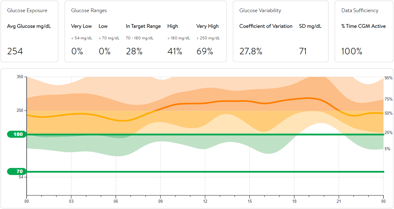
The AGP tab includes a summary of the glucose readings, from the set timeframe, shown as a modal day. The solid orange line- also called the median line- represents the midpoint value where half of the glucose values are found above the line, and the other half are found below. The darker shading represents the range where 50% of the values are found (25th percentile to 75th percentile) and the lighter shading represents the range where 90% of the values are found (5th percentile to 95th percentile). This color-coded visualization helps quickly identify general trends for the data. The AGP tab also includes the average glucose value and statistical variabilities for the dataset.
